Why Hong Kong Banknotes Look Different Even When They Are Worth the Same

Put two Hong Kong banknotes of the same denomination side by side and you may find yourself playing spot the difference. The colors can agree while the artwork and bank names do not. Neither note needs to be a novelty or a mistake. Hong Kong’s everyday money has an unusual feature: three commercial banks issue their own designs within the same currency system.
The names to look for are HSBC, Standard Chartered Bank (Hong Kong) and Bank of China (Hong Kong). They issue HK$20, HK$50, HK$100, HK$500 and HK$1,000 notes. The government issues the HK$10 currency note and coins. A bank’s name on a note therefore identifies an authorized issuer, not a separate kind of dollar. The face value, not your personal preference for the design, determines its denomination.
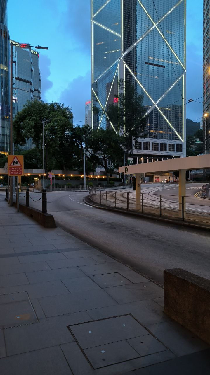
The Bank of China Tower in Hong Kong’s Central district. Image: Iming / CC BY-SA 4.0
That is the first answer in a wallet-sized finance quiz. Three banks do not mean three currencies or three exchange rates for matching denominations. The arrangement is governed by Hong Kong’s monetary system. It is not a case of a bank deciding to print attractive spending vouchers and hoping shops will accept them. The visual variety sits on top of a shared framework.
The second question is more entertaining: why is there dim sum on the money? In the banknote series announced in 2018, the issuers used common themes for each denomination’s reverse. HK$20 celebrates dim sum and tea culture, HK$50 features butterflies, HK$100 highlights Cantonese opera, HK$500 depicts the Hong Kong UNESCO Global Geopark, and HK$1,000 represents the city as an international financial center.
Those themes create a surprisingly broad portrait of Hong Kong. Finance gets the largest denomination, but a tea table, an insect and a performing tradition share the stage with it. Money is doing two jobs at once: carrying purchasing power and carrying an image of the place that uses it. A wallet can become a miniature design exhibition without its owner setting out to collect anything.
Common themes do not require identical artwork. Standard Chartered’s description of its HK$20 design centers on a family enjoying dim sum, with linked circular patterns representing connections between people. HSBC describes its 2018 series as a narrative connecting people, landmarks and nature, using watercolor imagery. Compare the interpretations and the interest lies in what each designer emphasizes, not in choosing which bank has produced the “correct” Hong Kong.
Try a simple challenge with notes you already have: identify the issuer before checking the denomination, then turn the note over and name its theme. In the 2018 series, the reverse uses a vertical layout. That change of orientation gives the designs room to tell their stories differently. Do not assume every older note will follow the same visual scheme; a series is a particular design generation, not the whole history of the currency.
The practical clues are not limited to pictures. The 2018 series includes features such as raised printing, a watermark and moving visual effects when a note is tilted. Accessibility matters too, with tactile features intended to help distinguish denominations. This feature is not an authentication guide: anyone uncertain about a note should consult the HKMA’s official security guidance or ask a bank rather than judging it by color alone.
Behind the artwork is a less visible financial mechanism. The institutional description of Hong Kong’s currency-board arrangements explains that issuing banks obtain Certificates of Indebtedness against US-dollar backing through the Exchange Fund. The specified rate for that issuance mechanism is HK$7.80 to US$1. That is a description of how banknotes are backed, not a promise that a traveler will receive that exact retail exchange rate after fees.
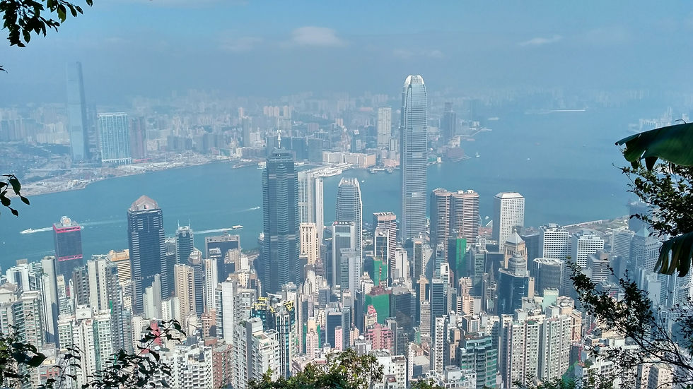
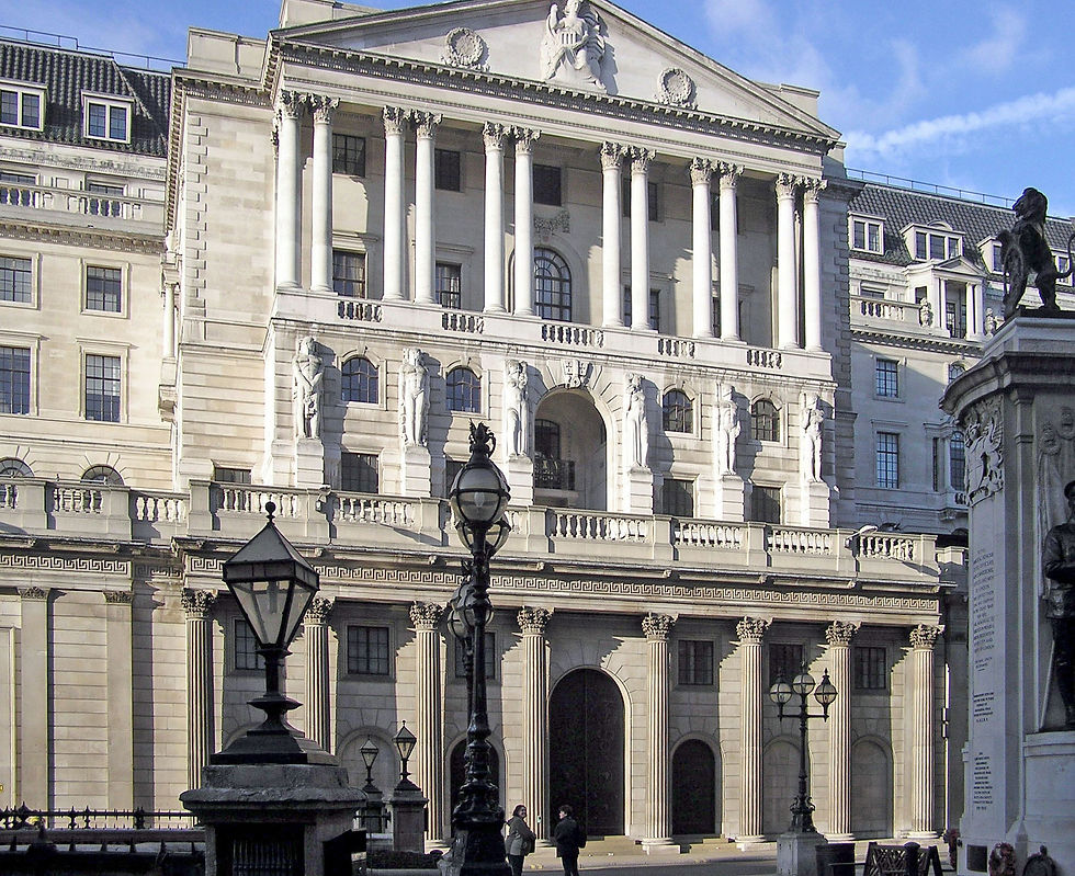
The contrast is what makes the subject fun. Something that looks like an assortment of competing designs belongs to a tightly organized monetary arrangement. Hong Kong’s stock-market lunch break offers another example of a local financial detail that can surprise outsiders without making the system incoherent. Understanding those details gives more texture to comparisons among New York, London and Hong Kong than a skyline photograph or a league-table ranking can provide.
There is no need to buy collectible notes or withdraw extra cash to enjoy the game. Next time a banknote passes through your hands, look at its issuer and the picture on the reverse before putting it away. You may find a family meal where you expected a famous face. The money still pays for the same things; noticing its design simply gives you one more story to bring to the table.
Comments